Product Update ·
A Fresh Look for Linxa, Inspired by Vintage Newspapers
A full redesign with warm paper tones, clearer typography, and more room to focus on your daily work.
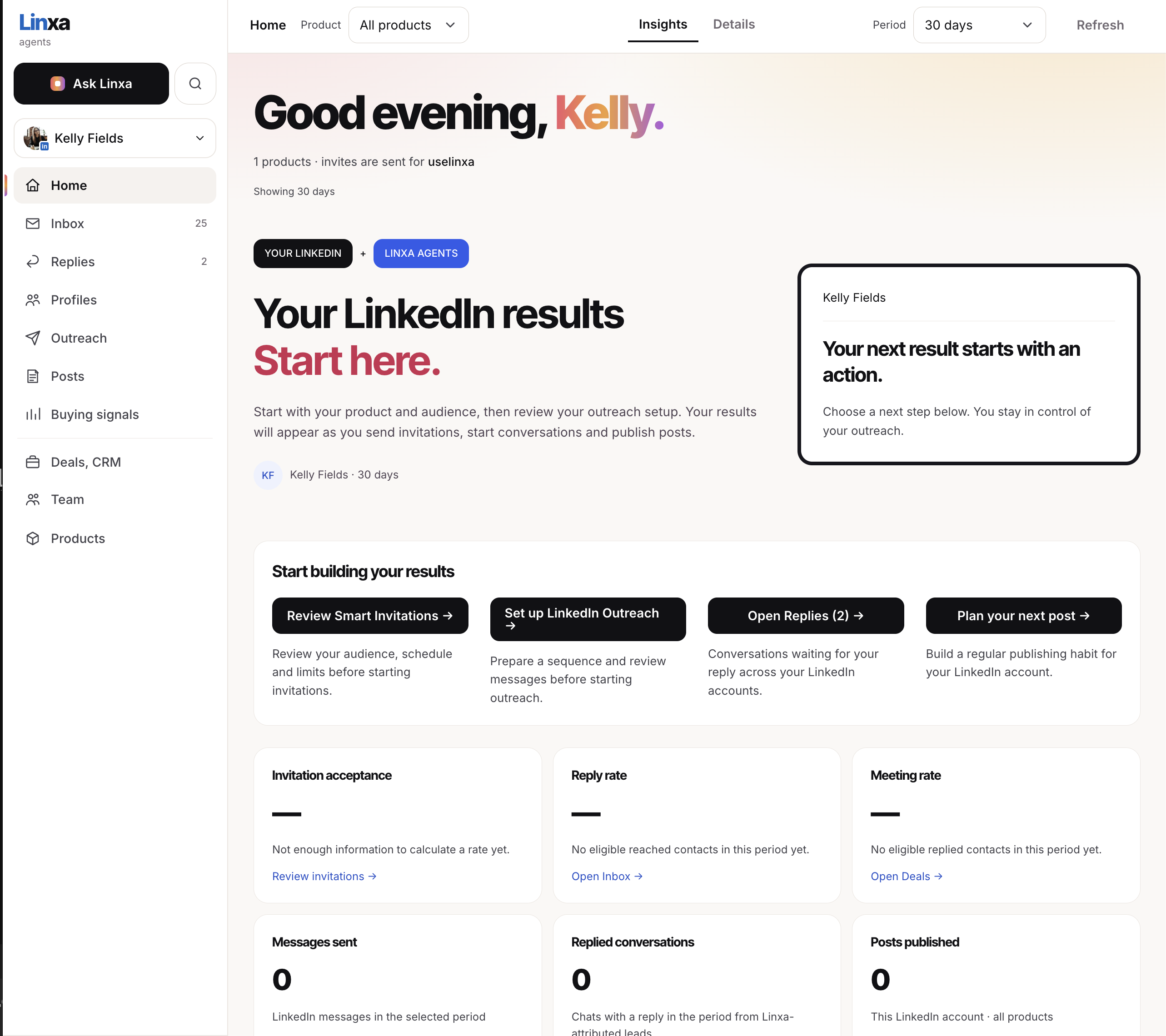
We have given Linxa a complete redesign to make everyday work feel more comfortable and visually calmer.
Warmth borrowed from the printed page
Our starting point was the warm paper of vintage newspapers. Soft ivory backgrounds, clean surfaces, and restrained color accents give the workspace a quieter feel. The palette was chosen with visual comfort in mind, especially when you spend time reading conversations and reviewing contacts.
Clearer reading. More room to focus.
We rethought the navigation, organized the content, and added more breathing room between elements. Expressive headings and readable body text create a clearer hierarchy, helping you find key information and see what to do next.
On Home, that means a clear view of your LinkedIn results alongside practical next steps: review invitations, prepare outreach, open replies, or plan your next post.
The new look reflects our attention to the details you work with every day, from the background behind a conversation to the placement of your next action.